Over the last week or two, I’ve started tracking the covid cases in Essex. I’ve actually created a little data tracker where you can track cases and deaths across every region in Essex. (The data is taken from official ONS data and uses the most up-to-date data available). I created it because I was curious about the number of cases in Essex, and especially the region of Tendring (where I live). All through the autumn, our rates of covid in Tendring were pretty low – but they shot up during December.
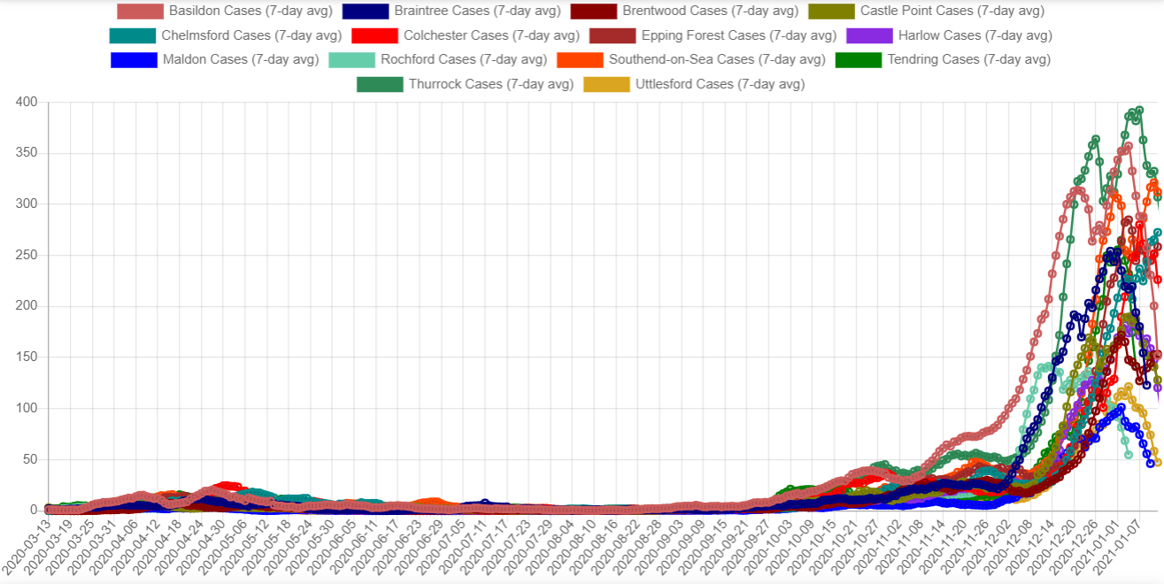
This is the graph of cases, starting from when the ONS data goes back to – 13th March.

As you can see, for about the first seven months the line remains pretty flat – it doesn’t really move very much even during the height of the pandemic. This is because mass testing wasn’t available at that point. The numbers stay fairly low through til late September. Then there’s a steep rise in early December, until it peaks on 4th January. It looks like the numbers are beginning to drop off again.
The figures certainly look worrying, don’t they? It definitely explains why Essex council wanted to put us into Tier 4!
However, where it gets interesting to me is when you start breaking down the cases by region.
Analysing the cases by region
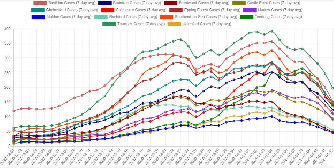
When you break it down by region, you see pretty much the same shape.
You can see that every region in Essex more or less follows the same pattern. What I find really interesting is when you start digging into the spike in December.
Zooming in on the December spike
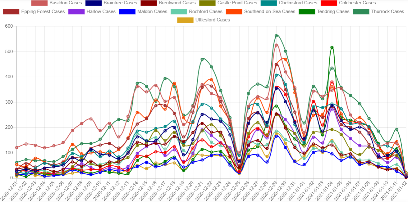
This is the same graph, but with the date range zoomed in from 1st Dec until 12th Jan.
Does anything strike you about the graph?
What strikes me is how remarkably similar the lines are. If you look at the rising and falling of the lines, the curves seem to match each other. They all (with the exception of Basildon) seem to start rising at about the same time, and then seem to start falling at about the same time.
Let me show you one more graph before we move on – this is looking at the raw numbers, not the 7-day average. (The 7-day average ‘smooths out’ the graph and means that extreme highs or lows don’t affect it so much).
Looking at the raw case numbers
You can see, for example, on 25th December there is a marked dip in new cases. Clearly not many people were doing covid swabs on Christmas Day! But there are many other places where the data seem to tally as well, e.g. Monday 21st and Tuesday 29th December, and Monday 4th January. I imagine this would be the ‘weekend effect’ in action – more people will send swabs on a Monday then on a weekend.
But it does prove that there is a high correlation between the number of cases and the number of tests run.
Unfortunately the ONS don’t seem to have the data about the number of tests by area, so I can’t compare this to the number of tests that were being run in this region. But for now let’s move on.
Comparing proportion of cases by area size
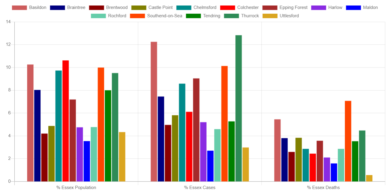
The graph on the left shows you how many residents are in each region of Essex, by percentage of population. The graph in the middle shows you the percentage of cases for that region out of the total. And the graph on the right shows you the percentage of deaths for that region out of the total.
Again, does anything strike you about this data?
What strikes me is that the cases and deaths seem to roughly follow how big the area is. So, for example, Basildon and Thurrock are two of the biggest areas in Essex. They have the most number of cases, and they also have a relatively high number of deaths. So the percentage of cases more or less seems to tally with the size of the area.
How many tests are being run?
As we saw, there seems to be a high correlation between the number of tests being run and the number of cases being found. It would be helpful to know how many tests were being run, as we would be able to compare it with the graph to see if it matched up. Unfortunately we don’t have that data. The ONS don’t seem to provide it.
It looks like the average positivity rate for a PCR test is around 7% – so for every seven positive tests, there would have been 93 negative. If we apply that to the numbers above, at the very peak across Essex on 29th December, 3666 cases, that would mean about 48,000 tests would have had to be run.
What can we make of it?
What I find bizarre about these graphs is that it doesn’t really seem to be tracking a virus moving across an area. If it did, I would expect to see more regional variations. Why is it that across the entire region of Essex – that’s 1.8 million people – the case numbers start to rise on pretty much the same day, then peak all at the same time, then seem to decline all at the same time?
If we were looking at actual cases of covid moving across an area, I would expect to see the cases start to rise and fall at different times across all the regions as it moved through. But that’s not the case.
No, this looks to me like something to do with testing. Imagine that you had a testing laboratory where every test had a 5% chance of coming back positive. Then multiply that by the number of tests and the number of people in an area. You would end up with a graph which looked very similar to the graph I showed above.
The big question in my mind is, why did the numbers seem to all go up at the start of December (and then come down in January)? Did they change something with testing? Did they start running more tests in Essex? Did they change something in the laboratory? What happened?
I find it entirely implausible that this is anything to do with the number of people across Essex who have had covid. If it were, there would almost certainly be far more variance in the data. To end up with the data that we have seems, to my mind at least, beyond anything we could reasonably consider a coincidence.
The problem with mass testing
The website PCR Claims was started to the problems with mass PCR testing. Earlier on someone sent me the video with the pathologist Dr Clare Craig. (I can’t link directly to the video – as I write it’s the top-middle video from that page).
PCR Tests were never designed to be used to mass test asymptomatic people. Add to that the fact that there have been serious problems in UK test centres, and you have a recipe for just this kind of thing. Will we ever find the answers? I don’t know. What worries me is that no-one in government seems interested in actually getting to the bottom of it.
It wouldn’t be such a problem if the government weren’t basing so much of their policy at the moment on the number of “cases”. We should be looking far more at the number of excess deaths and where things are with hospitals, rather than relying on testing to tell us everything.
If we carry on relying on PCR tests, I think we’re never going to get anywhere.
You can check out my Essex covid data tracker for yourself if you like. Please bear in mind that it was just developed out of interest, not to be used by the general public, and it is more than a bit rough and ready.
Leave a Reply